The Designed World: How to Read Rooms in Film
Candlelight
In 1975, Kubrick’s Barry Lyndon was released. The film is set across eighteenth-century Europe, and the candlelit rooms look almost like period oil paintings. When it comes to film, many don’t realise how much work goes into the sets, or how many people it takes to achieve the final result that you see on screen. Even if the locations team find a near-perfect location, every element still has to be designed, sourced, and lit to a specific visual requirement. The art department on Barry Lyndon sourced genuine eighteenth-century furniture, paintings, and objects. Special lenses were developed with NASA so that the film could be shot by candlelight, as Kubrick believed electric light would be a lie, and that getting the colour temperature wrong with lighting would undermine the film’s messages.
The rooms in Barry Lyndon are full of heavy drapery and gilt frames, and the candlelight both flatters and obscures. The world of the film tells its own story even before you add in the characters and the dialogue.
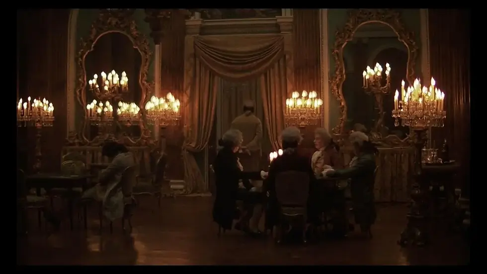
Barry Lyndon, 1975, dir. Stanley Kubrick. Production design: Ken Adam. Lord Lyndon illuminated by nine sets of candle holders | © Warner Bros
The Art Department
Production design is the discipline responsible for the visual world of a film, everything that the camera sees, and the production designer works with the director to establish what the film will look like weeks before shooting starts. Together they discuss the colours, textures, period accuracy, and the relationship between the characters and their spaces and how they can immerse the audience in their world.
When talking about design in film, it’s important to understand the art department as a whole. The designer is the head of department who conceives the space, colour palette, and oversees the design. Their team consists of an art direction team, a set decoration team, a props team, construction, graphic designers, drapes, florists, action vehicles, home economists, and more. The art directors are like the architects, they draw up the build plans and liaise with construction teams.
The set decorator is more like the interior designer. This is what I do, hence the smooth decorator pun on my name. We help determine colour schemes, source wallpapers, flooring, tiles, plug sockets, light switches, everything that makes a set feel real, as well as the things which make it feel like an inhabited space: furniture, curtains, books, glassware, lamps, and everything else. Both art direction and set decoration are creative disciplines in their own right, and not many people, even in the industry, actually understand the difference between them. If the director and designer decide who the character is and how they live, we help build those specifics. We think about the small things as much as the larger ones - the selection of objects on a character’s bedside table tells you as much about them, if not more, than the choice of wallpaper in their bedroom. Nancy Haigh, who has worked with the Coen Brothers across multiple films, describes set decoration as writing a character biography through objects.
The British film industry works differently from the American one, and our departments are relatively separate. The production designer oversees the art department, and works with but does not have creative oversight of the costume, which is under the costume designer. The two departments communicate on colour and period accuracy, and sometimes we borrow clothes from costume to dress into character spaces, but the two departments work independently. And there are some interesting divisions between the two departments too, eg: hats are costume, but helmets are art department, and bags are art department unless they’re handbags, or, unless the costume team decide they need something specific for a particular character. It’s worth understanding the collaboration across the two departments as it’s essential in order to have a character that feels like they belong to the world they inhabit, and if you watch closely you’ll pick this up. A main character’s bedroom will almost never be the same colour as their main wardrobe colours, for example, so that they don’t get lost in their background, unless this decision is made deliberately.
The role of Production Designer as a distinct profession emerged in the 1930s and 1940s, though designers existed in the industry before this. In the UK, the studio system at Pinewood, Shepperton, and Denham developed a rigorous tradition of art direction that was, in some respect, more technically demanding than its Hollywood equivalent. British films frequently built complete interior worlds on sound stages, partly because of the unreliable weather and partly because of the strong tradition of craftsmanship inherited from theatre and architecture. Ken Adam, who designed the Bond films from Dr. No (1962) onwards, as well as Barry Lyndon, trained as an architect and brought that discipline’s spatial thinking to his film work. His sets for the Bond films, the volcano interiors of You Only Live Twice, and the war room in Dr. Strangelove, are among the most spatially ambitious sets ever built on a sound stage. The credit for the role of Production Designer rather than Art Director became standard in Britain through the 1970s and 1980s, reflecting a growing recognition that the role was conceptual and directorial rather than simply technical. Many assume, even those in the industry, due to the word ‘director’ in the title, that the art director is the one in charge, but this is not the case in film and television production. Despite this, in commercials and music promos, the head of the art department often is called the art director, which can be confusing if you work across both sides of the industry.
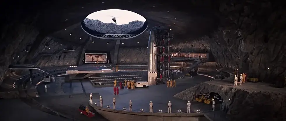
The volcano lair set, You Only Live Twice, 1967, dir. Lewis Gilbert. Production design: Ken Adam. Built at Pinewood Studios at a cost of $1 million | © Eon Production
Reading the Room
The easiest way to understand what production design is doing is to look at films where it is doing something unusual, because that’s where it stands out most.
Colour is a good thing to look for. In Don’t Look Now (1973), red was used as a recurring visual motif throughout the locations in Venice. There were red coats, red glass, red water, and the more specific red anorak too. This has the effect of almost making the colour another character in the film, and it conditions the audience to respond to red as a signal of dread without saying anything. Red is used in a similar way in The Sixth Sense (1999), where the colour appears every time something supernatural happens.
The size and perspective of the sets can also be changed to portray an idea to the audience. In The Godfather (1972), the Corleone family’s rooms were deliberately oversized, with high ceilings, large furniture, and long corridors. This had the effect of the family always seeming slightly dwarfed by their own world, in a way they’re at the mercy of the architecture that they’ve built around themselves. It’s subtle, so you might not have consciously noticed it without already knowing, but you would still notice that something feels off about the rooms in a way that although impressive, makes them slightly uncomfortable.
Period accuracy is also a complicated element of design. When working on a period film, a designer doesn’t just try to reproduce the past accurately, but in a way that the audience will understand and feel it. The rooms in Barry Lyndon are historically accurate in their materials and objects, but they are lit and composed to make the audience feel the weight of the period, not simply to document it. This also works in films that are purposely inaccurate, take Sofia Coppola’s Marie Antoinette, for example, the decision was made that the aesthetic of girlhood would come before historical accuracy. The aim was to immerse the audience in the world of Marie Antoinette, who was just fourteen when she was sent from Austria to become queen of France, and who didn’t know much about life beyond the gates of Versailles - obviously, we all know what happened to the real Marie Antoinette, but that’s not what the film is about. Here the fact that the film was not historically accurate didn’t matter because the audience was not supposed to think about the real history, and what would happen to the young queen, but to believe her life at Versailles despite the inaccuracies.
Contrast in environments is also deeply thought about, particularly in films which have a political message. In Parasite (2019), two houses were built: the modernist home of the wealthy Park family, and the semi-basement flat of the Kim family. Even before there is any dialogue about class, space, and aspiration, the sets tell us everything we need to know. Neither of the houses are naturalistic, the differences are heightened to support the point of the film, bringing space into the political argument.
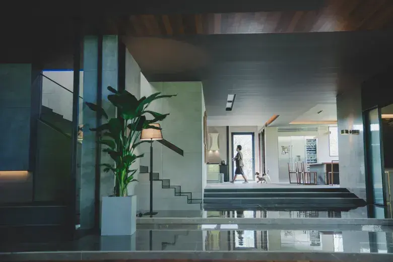
The Park family house interior, Parasite, 2019, dir. Bong Joon-ho. Production design: Ha-Jun Lee. Both the Park house and the Kim semi-basement were built as sets | © CJ ENM Corporation / Barunson E&A
Training Your Eye
Most people watch films without consciously registering the production design. This is partly because some of the best design is invisible, it’s not supposed to announce itself or distract from the story. We’re not trained to look at design in the same way we are to listen to dialogue or follow narrative, so there are certain things that you have to look for:
What does the room say about its inhabitant? Sets are designed to be portraits of character. Every prop, its condition, and its placement, are all thought about. In Carol(2015), production designer Judy Becker gave Carol’s apartment a specific look, with beautiful objects which were clearly chosen with care, but arranged without personality. This tells you about Carol’s relationship with her own life before she’s said anything about it herself.
How does the room make you feel? Something as simple as whether a set is designed with high or low ceilings is a decision that can create two different experiences. The same goes for wide versus narrow corridors, or whether the windows of the room look on to something or just the wall of another building. These are techniques which are deliberate, and when a set makes you feel uncomfortable, see if you can figure out whether that’s due to what’s happening in there, or from the space itself.
What is the colour doing? It’s not always as obvious as in Don’t Look Now or The Sixth Sense, but the overall ambience of a film and its colour palette can be used as a storytelling tool. Warm tones and cool tones create different feelings, and many films shift between the two as the story develops, or between different characters.
What’s missing? An empty space is as designed as a full one. For example, the white rooms in A Single Man (2009), are helping to explore the themes of grief, containment, and suppression of feeling that are discussed in the film.
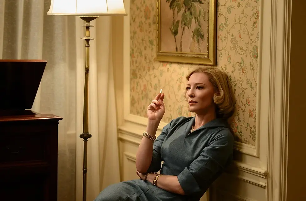
Carol, 2015, dir. Todd Haynes. Production design: Judy Becker | © Film4 / Killer Films / Number 9 Films
The Invisible Work
One of the reasons that production design is so interesting is because it works below the level of conscious attention. Audiences are usually aware when they are being told something through dialogue or performance, but not so much when they are told through the sets. This is what makes design so effective as a tool, it has the ability to make the audience uncomfortable without immediately knowing why.
A film’s visual world is the result of conversations between the director, the designer, the director of photography, and costume designer, as well as many others and over months of preparation. The production designer is one of the people most responsible for the look of a film, and their vision is realised by their team, often the largest on a production, yet the art department are among the least discussed outside of specialist circles.
This matters because the visual world of a film isn’t neutral. Every room is thought about with both the characters and the viewer in mind. Once you understand how production design works, the way that you consume film and television changes too.
Further Research
Reading:
Christopher Frayling’s Ken Adam: The Art of Production Design (Faber, 2005) is the best single book on British production design and the place to start if you want to understand how the discipline developed in this country.
On Kubrick, a good starting point is Alison Castle ed. The Stanley Kubrick Archives (Taschen, 2005). It’s expensive but a great resource including production design documents, set sketches, and correspondence that tells us how Kubrick thought about space and surface. Even as someone who isn’t a massive Kubrick fan, I’d say it’s worth a look through. Taschen also publishes smaller Kubrick volumes if this one feels like a lot.
Beverly Heisner’s Hollywood Art: Art Direction in the Days of the Great Studios(McFarland, 1990) is the most thorough historical account of how production design developed as a discipline, covering the studio system period in detail.
Vincent LoBrutto’s By Design: Interviews with Film Production Designers (Praeger, 1992) is exactly what it says. It’s a series of long interviews with working production designers where they describe the discipline in their own words.
Production Design and Art Direction by Peter Ettedgui (Rotovision, 1999) covers a range of contemporary designers with good visual material.
For the relationship between film and architecture specifically, Dietrich Neumann, ed. Film Architecture: From Metropolis to Blade Runner (Prestel, 1999) is the standard academic text, covering how architects and film designers influenced each other across the twentieth century.
On set decoration specifically, there is relatively little dedicated writing, which reflects the wider neglect of the discipline (quite possibly due to it being the female-dominated side of the art department…). The best accounts tend to be in interviews. The British Film Designers Guild (filmdesigners.co.uk) has industry context alongside member profiles. BAFTA also covers production design and set decoration in its craft awards and the bafta.org website publishes interviews with nominees and winners which are more candid and technically specific than press junket material.
Watch:
The best way to develop an eye for production design is to rewatch something you know well without the sound for ten minutes. The design is more visible when it’s not fighting with the dialogue for your attention.
Barry Lyndon (1975, designer: Ken Adam). The interiors and the candlelight tell the story well alongside the script.
The Godfather (1972, designer: Dean Tavoularis). Power is represented through oversized rooms and clever lighting.
Parasite (2019, designer: Ha-Jun Lee). Design is used to make the politics of space support the films message.
In the Mood for Love (2000, designer: William Chang Suk-Ping). Uses tight corridors, recurring spaces, texture, and proximity to represent emotions.
Don’t Look Now (1973, designer: Giovanni Soccol). Colour is used throughout the film’s world, intended to make the audience feel dread.
The Grand Budapest Hotel (2014, Adam Stockhausen). The design explicitly quotes design history.
Visit:
BFI Southbank runs retrospective programmes that regularly include design-focused work. Their programme is at bfi.org.uk. The BFI National Archive in Berkhamsted holds production design documentation, concept art, and set photography for major British films, accessible by appointment.
The Design Museum in London (designmuseum.org) has covered film and production design in various exhibitions.
The Victoria and Albert Museum holds costume and production design from significant British productions in its Theatre and Performance collection, some of it accessible online at collections.vam.ac.uk.
Other Things to Look At:
The Parasite production design archive. Ha-Jun Lee gave several detailed interviews about the design of both houses, with floor plans and process photographs which can be found through the BFI and other film press. The floor plan of the Kim family’s semi-basement is especially worth studying.
The Ken Adam Archive includes sketches and documentation from the Bond films and Barry Lyndon. It’s held at the BFI National Archive and has been partially digitised. Adam’s architectural drawings for the Bond sets show how he was thinking about space as a spectacle.
Thanks for reading! Subscribe for free to receive new posts and support my work.
Sources
Most of the production design history in this article draws on Beverly Heisner’s Hollywood Art: Art Direction in the Days of the Great Studios (McFarland, 1990), and Vincent LoBrutto’s By Design: Interviews with Film Production Designers (Praeger, 1992). On Ken Adam specifically: his training as an architect and his approach to the Bond sets are documented in Christopher Frayling’s Ken Adam: The Art of Production Design(Faber, 2005), the most authoritative account of his work and the best single source on British production design of the postwar period.
On the NASA lenses and Barry Lyndon’s candlelight photography: John Baxter’s Stanley Kubrick: A Biography (HarperCollins, 1997), and Alison Castle, ed, The Stanley Kubrick archives (Taschen, 2005), which reproduces correspondence and production documentation on the lens development. The claim that Kubrick believed electric light would be historically dishonest is from his own interviews, collected in Michel Ciment’s Kubrick: The Definitive Edition (Faber, 2001).
Nancy Haigh’s description of set decoration as writing a character biography through objects is widely attributed to her interviews with the Art Directors Guild, published in Perspective magazine. The specific formulation varies across sources.
On the colour motif in The Sixth Sense, this is widely observed by critics and film scholars rather than confirmed in a single primary source. Production designer Larry Fulton has discussed the film’s palette in interviews but the systematic red motif analysis is the most fully developed in scholarly writing on the film rather than by the production team directly.
On the Corleone family rooms in The Godfather, Dean Tavoularis has discussed his approach in various interviews. A good secondary source is Michael Ondaatje, The Conversations: Walter Murch and the Art of Editing Film (Knopf, 2002), which covers the visual design of the film in depth.
On Parasite: Ha-Jun Lee’s interviews about the design of both houses, including floor plans, are available via the BFI website and the Criterion Colelction. The most detailed account is the Criterion booklet essay accompanying their 2020 release.
Thanks for reading! Subscribe for free to receive new posts and support my work.
Closing Note
The rooms we inhabit can be used to reveal how we feel about our own lives. We as humans respond to space, light, proportion, and material, and production designers use this to build worlds which can tell us about a character before they say anything.
The Arts and Crafts designers we looked at on Sunday were making the same argument in a different medium. They understood that rooms aren’t neutral, and that the spaces people live in say something about what they believe and who they think they are. Film takes that point and accelerates it, compressing years of habitation into two hours, making visible in ninety minutes what a lived-in space takes a lifetime to accumulate.


Comments